Brand system
The Hatch brand.
Everything that makes Hatch look, sound, and feel like Hatch — the mission behind it, the logo, the colour, the type, and the assets to use it all. Built around one promise: your app, hatched in days.
Why Hatch exists.
We give small and medium businesses software that actually fits — built around how they really work, and shipped in days, not quarters.
Mission
To put custom-fit software in the hands of every small and medium business — designed around their exact workflow, live on every device, and delivered fast enough to matter.
Vision
A world where owning software built exactly for you is no longer a luxury reserved for the enterprise. Where any business can move at the speed of its own ideas.
What we stand on.
Built to fit
We design around your workflow — never force you into someone else's template.
Ship fast
Momentum is a feature. We move in days, not quarters, and never let scope drift.
You own it
Premium work, owned outright by you. The code is yours — no lock-in, no hostage.
Clarity over complexity
Fixed scope, clear finish lines, plain language. Serious software without the theatre.
How Hatch sounds.
Bold, high-energy, and confident — but never cold. We talk like a sharp founder who ships: direct, concrete, a little swagger, zero corporate fog.
Do
- Lead with the outcome — “your app, live in days.”
- Be concrete and plain-spoken. Short sentences. Real verbs.
- Speak to the owner who feels the pain, founder to founder.
- Carry energy and confidence. We ship; say so.
Don't
- Lean on jargon, buzzwords, or “synergy / solutions” filler.
- Overpromise or hype without something concrete behind it.
- Sound like a faceless enterprise vendor.
- Bury the point in hedging or long wind-ups.
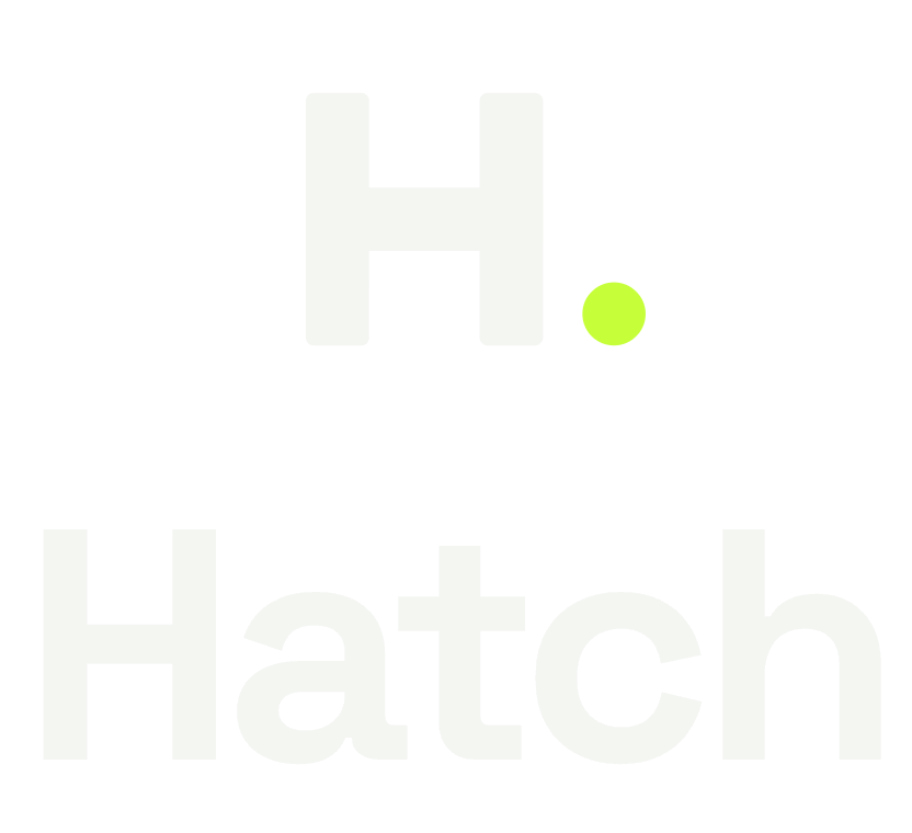
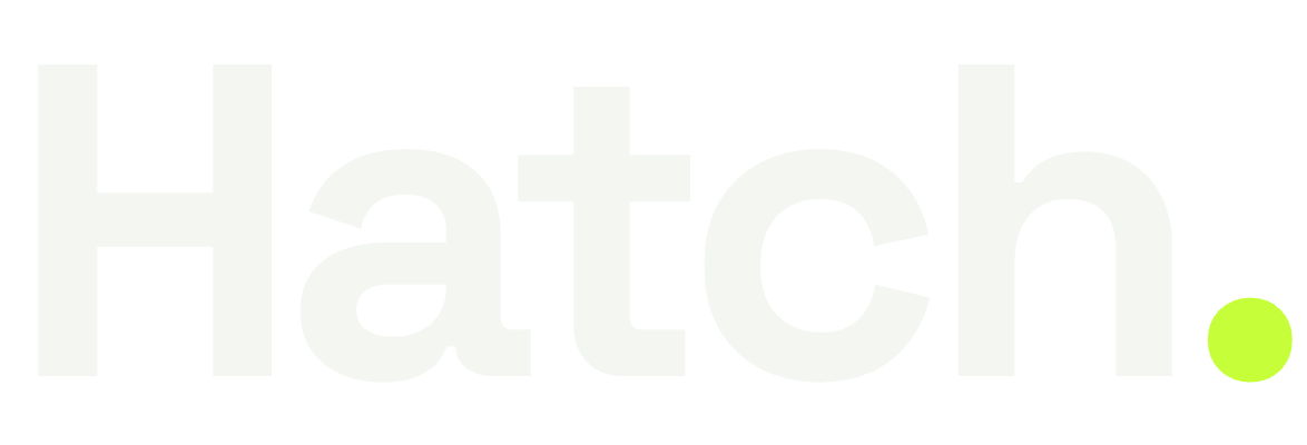
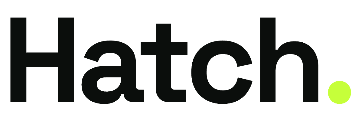
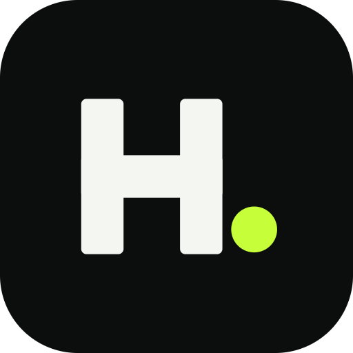
The mark.
The Hatch mark is an “H.” — a bold geometric H with a single electric-lime dot. The dot is the signature; keep it. Use the on-dark mark on ink, the on-light mark on white.


Keep it clean.
Give the mark room to breathe — clear space on every side at least equal to the height of the lime dot. And a few things to never do:


Electric Lime.
A near-black ink canvas charged by a single electric lime. Lime is an accent — CTAs, the dot, key words — never a full background. Tap any swatch to copy its hex.
Two typefaces.
A geometric display face for impact, a clean neutral face for everything you read.
Grab the whole kit.
Logos, marks, lockups, favicons, colour & type — every asset on this page in one download.